Supporting Colour Trends With Flooring
Colour trends in commercial flooring are continually evolving as architects, designers, and organisations seek to create engaging, functional environments that support productivity, collaboration, and brand identity.
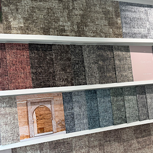
One of the most effective ways to incorporate these trends is through carpet tiles, particularly those such as the Pattern Play collection from Milliken, which offer exceptional flexibility for commercial projects.
Milliken’s Pattern Play collection enables designers to introduce subtle colour palettes, create bold feature areas, or reinforce existing brand and interior schemes within a space. By combining colour with textured and patterned carpet tiles, commercial interiors can gain added depth, improved spatial zoning, and greater visual interest across offices, education facilities, hospitality environments, and other high-traffic commercial settings, without committing to a single, uniform flooring design. Along with the opportunity to incorporate creative spaces, sustainability and wellbeing are central to the collection’s design, with tiles manufactured in Wigan using renewable energy, containing 61% recycled content by total weight and a backing made from 95% recycled materials.
We take a look at four of the most predominant colour trends and how you can support these schemes using examples from Milliken.
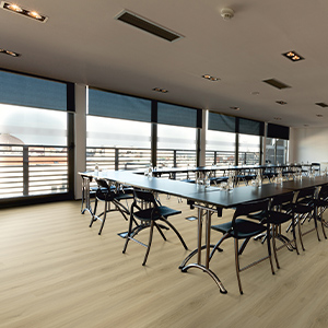
Neutral Themes
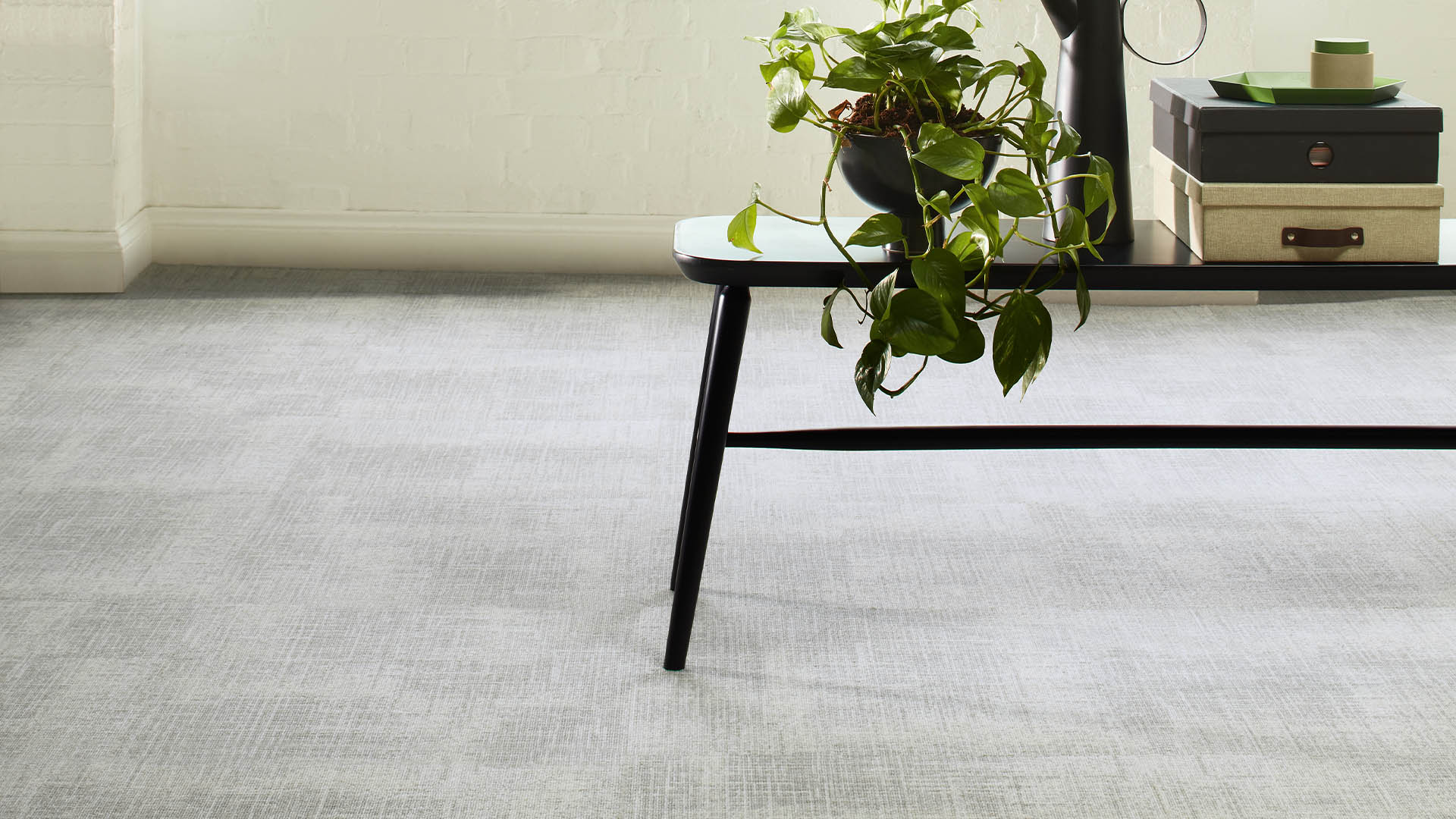
Neutral colour palettes remain one of the most enduring flooring colour trends, particularly in offices, reception areas, and lobby spaces where a calm, professional atmosphere is essential. Soft greys, warm beiges, and light stone tones create a versatile foundation that complements a wide range of interior styles. In spaces like the one shown above, the flooring demonstrates how a neutral carpet tile with a subtle, woven-style pattern can elevate an otherwise minimal palette.
The delicate pattern introduces texture and movement across the floor, preventing the space from feeling flat while still maintaining a refined, understated look. This approach works especially well in interiors with neutral walls and ceilings, where the flooring becomes a quiet design feature that adds depth and visual interest.
By incorporating lightly patterned carpet tiles in neutral tones, designers can achieve a contemporary twist on traditional office and lobby environments, balancing timeless simplicity with modern design detail.
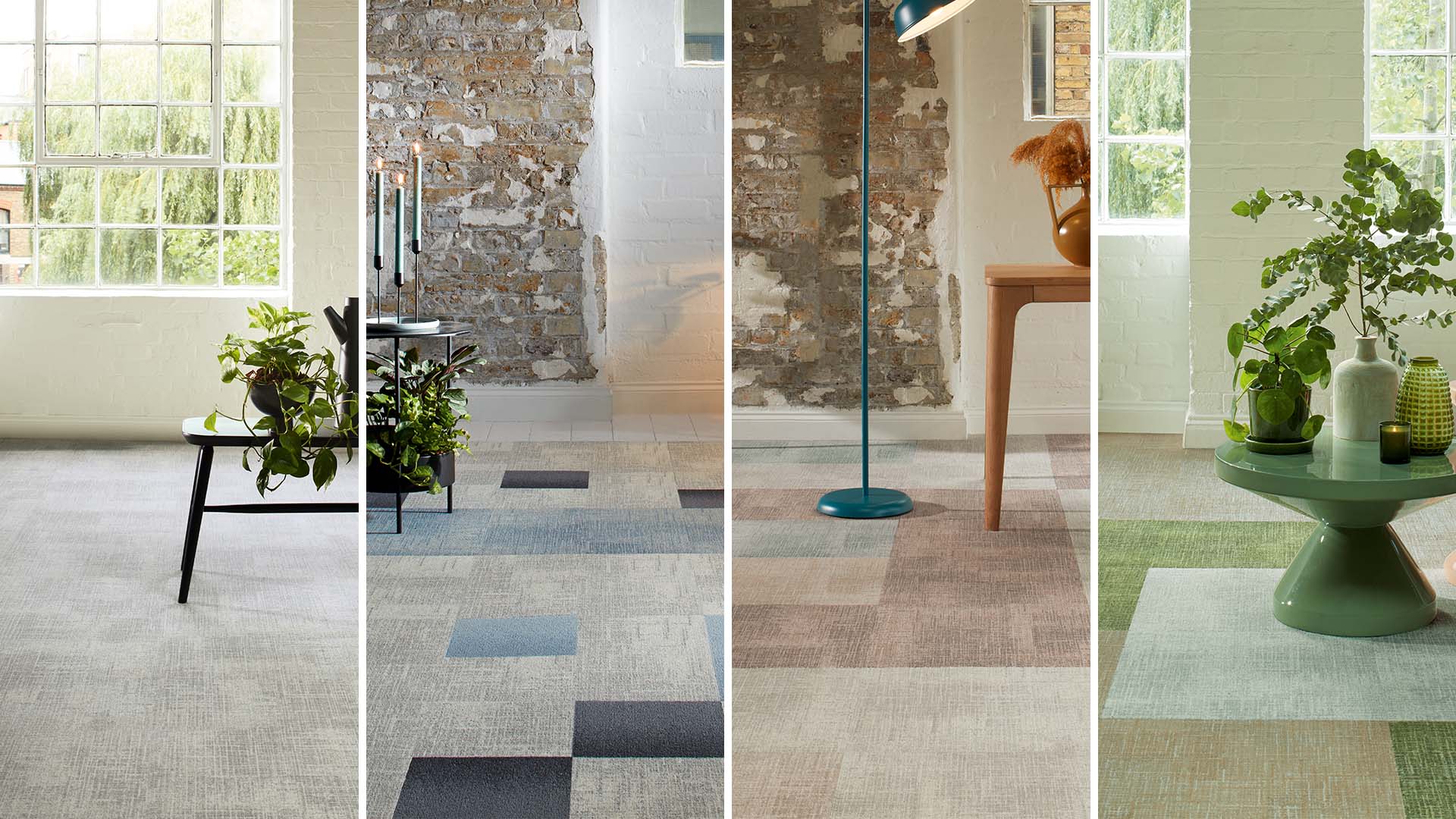
Earth Tones
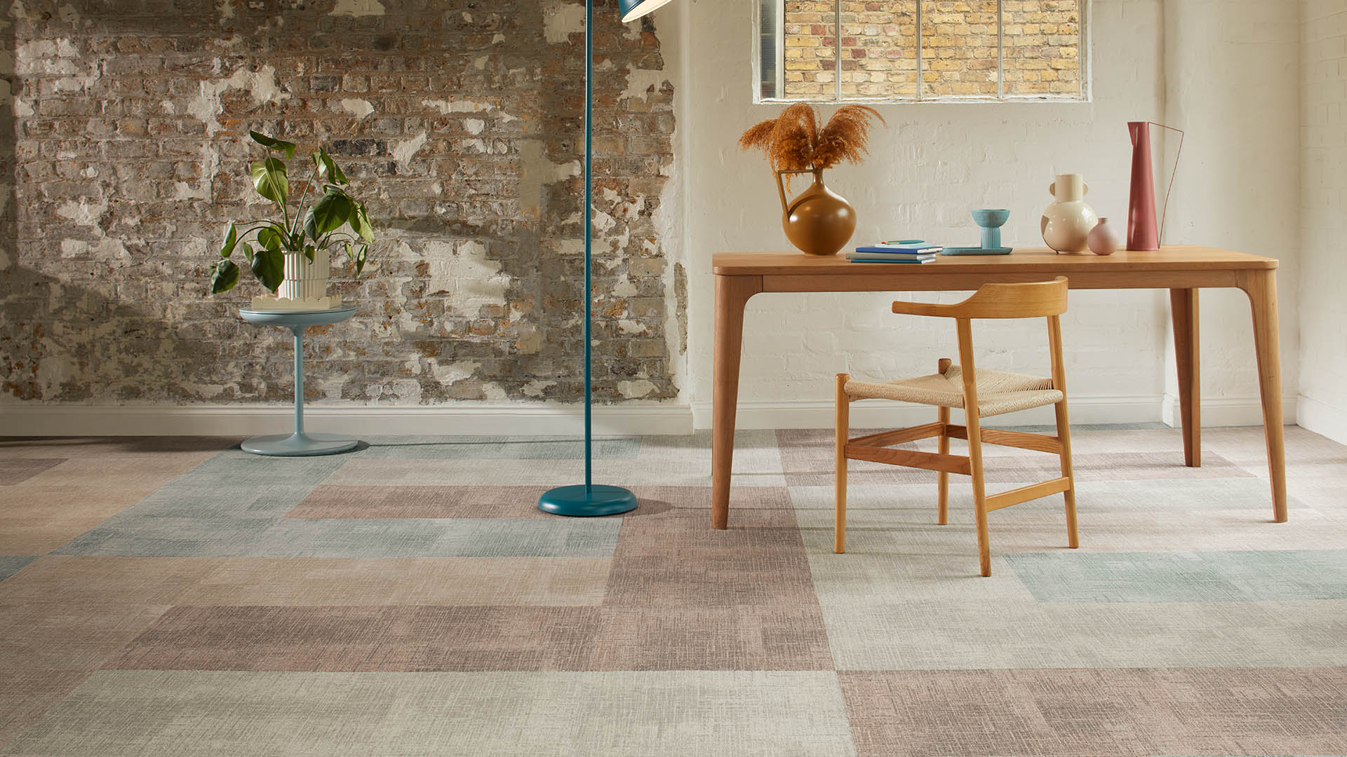
Earth-toned flooring palettes are becoming increasingly popular in commercial interiors, particularly across office and hospitality design projects, as organisations look to create spaces that feel warm, grounded, and welcoming.
Shades inspired by nature, such as clay, terracotta, sand, and muted greens, help soften contemporary interiors while supporting the growing focus on wellbeing and biophilic design in workplaces.
In the image above, the combination of warm clay hues with softer neutral and muted green tones demonstrates how patterned carpet tiles can introduce subtle colour variation while maintaining a cohesive and calming environment. These palettes work especially well in reception areas, collaborative spaces, and hospitality settings where designers want to create a relaxed yet sophisticated atmosphere.
The rise of these tones is also reflected across the design industry, with clay-inspired colour schemes appearing frequently at the recent Workspace Design Show, highlighting a clear shift towards warmer, nature-led palettes that balance modern aesthetics with comfort and authenticity.
A Refresh
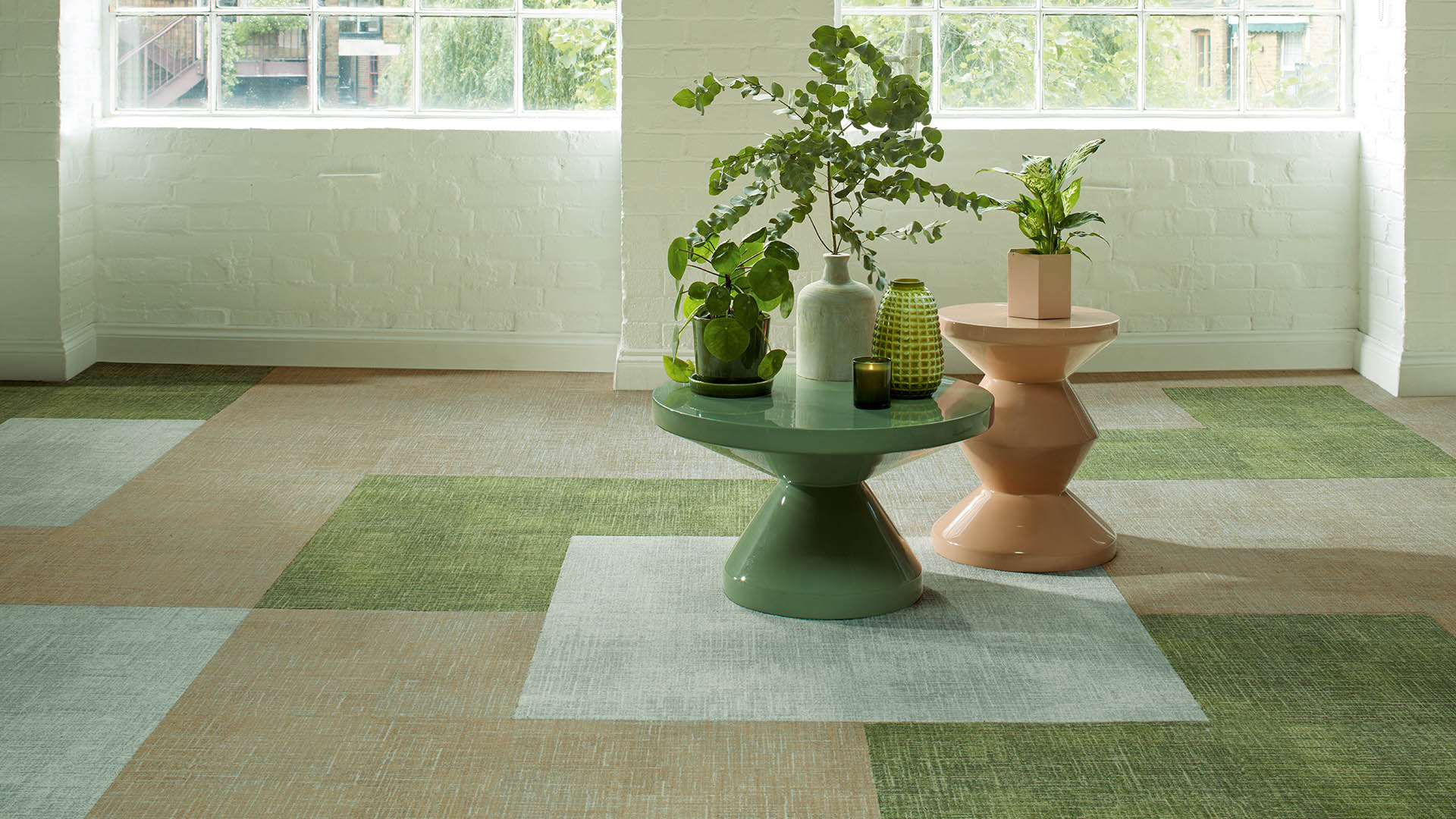
Green tones are increasingly being used in commercial flooring to introduce a refreshing, nature-inspired aesthetic into office and lobby environments.
Shades ranging from soft sage to deeper moss greens can help bring a sense of calm and balance to interior spaces, making them particularly effective in workplaces where wellbeing and productivity are priorities.
In commercial settings, green works well because it subtly references nature without overwhelming the overall design scheme, pairing easily with neutral palettes, natural materials, and contemporary furnishings. When incorporated through patterned carpet tiles, green tones can also help define zones within open-plan offices or reception areas while adding visual interest to the floor.
This biophilic approach to colour helps create environments that feel more welcoming and energising, fostering collaboration and inspiring creativity among teams and visiting clients alike.
Cool Contrasts

Mixing blue tones in flooring design, from soft, airy blues through to deeper denim shades, can introduce a contemporary, cool aesthetic to commercial interiors.
This palette is particularly effective in offices, lounges, and reception areas where designers want to create a calm yet modern atmosphere. Blue is widely associated with focus, clarity, and trust, making it a popular choice for workplace environments and client-facing spaces.
When incorporated through patterned carpet tiles, layering multiple shades of blue can add subtle movement and visual interest across the floor. Pairing these cooler hues with neutral tiles such as light greys or soft stone tones helps balance the palette and ensures the blues stand out without overwhelming the space. The result is a sophisticated flooring design that feels fresh, professional, and visually dynamic while still maintaining the versatility needed in commercial interiors.
If you enjoyed reading this, you may like The Sisal Edit